Inclusive App Design and Strategic Branding for Communication Accessibility

Háblalo is a free app created by the entrepreneur Mateo Salvatto in order to help deaf and hard of hearing people, people with cerebral palsy, ALS / ASD, or any other difficulty to communicate.
This application uses voice-to-text and text-to-voice technologies, as well as other special functions to give autonomy, assistance, and inclusion to people with disabilities, and to provide companies and organizations with a system that facilitates communication with people with different capacities. Háblalo is an app that is used by hundreds of thousands of people, in more than 50 countries across all continents, with recognition from companies such as Google, the Massachusetts Institute of Technology, and Peking University.
Social Impact
This is the first of the social impact projects that we have faced as a way to empower entrepreneurs whose projects and vision captivated us, and in turn, we saw the clear possibility of helping them in any of the disciplines in which we specialize. (Strategy, Branding, and Design, Digital Product, UX/UI)
STRATEGY
Initially, this project was going to focus on the development of the new UX/UI design of the app, but as the research and immersion stage progressed we understood that the success of the Hablalo app did not depend solely on its user experience. Reaching the greatest number of people in the world with a message that would overcome taboos and cultural prejudices was vital for the project, which is why we decided to rethink the Hablalo app as a brand and product in an integral way.
BRAND
- Identity Design
- Logo Design
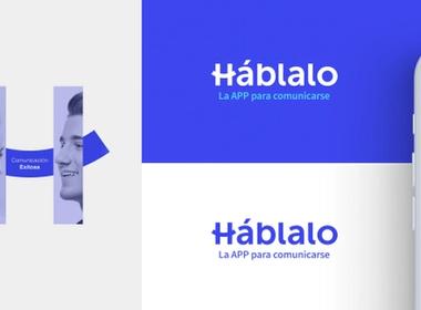
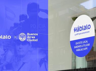
We created a friendly and positive brand, with the certainty that Háblalo's success depended on its ability to reach the public, users, and generate a commitment to it. For this reason, we worked on the messages and the tone of voice of the brand, which is clearly reflected in the tagline that goes from being “the app for the deaf” to a universal and positive message like “the app to communicate”.
From the visual aspect of the brand, at Disruptive, we have created a simple identity, with soft features, with a logo that bases its distinctive gesture on the theory of communication, where there is a sender, a receiver, and a message that unites them, in this case, executed through a curved line that refers to a smile, perhaps one of the most universally recognizable positive non-verbal gestures.
“Háblalo logotype refers to a smile, perhaps one of the most universally recognizable positive non-verbal gestures”
DIGITAL PRODUCT
- App Design
- Ux&Ui
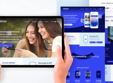
- Site Design
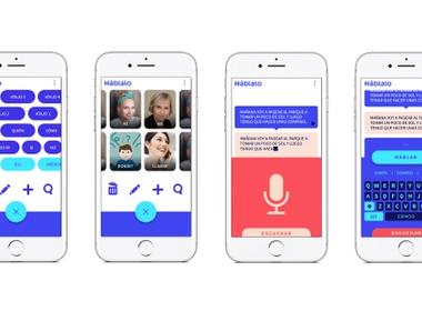
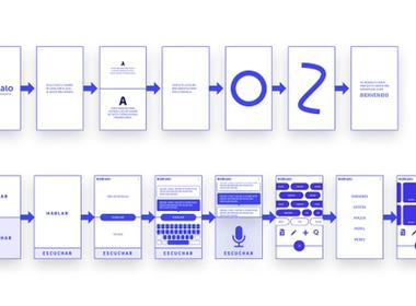
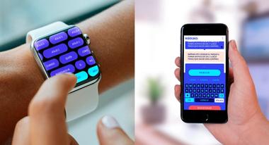
Our work in rethinking the Háblalo application is based on several aspects, of which most can go unnoticed, but as a whole, they aim to create a friendly, clear, positive, inclusive, and intuitive experience.
It was not our intention to make anything up ... we wanted to be absurdly obvious and expected.
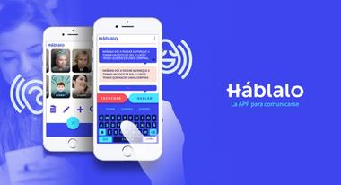
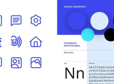
Due to the great diversity of ages, cultures, and disabilities of its users, the graphical system of the UI had to use a color palette with light contrasts suitable for color-blind users, functional entities of legible size, and a typeface with an excellent visual performance. For the typeface we selected the Google Fonts, Noto Sans, designed to be visually harmonious in several languages, with compatible stroke heights and thicknesses, ensuring legibility and consistency in the design of the Háblalo app in all possible languages in which the application is used.
The main functionality of Háblalo is none other than a “chat”, so it was natural for us to propose a design that would emulate the basic behavior of any existing messaging application.
 Awwwards