Yo Me Animo
From a fan blog to the largest community of travelers in Latin America. YoMeAnimo is a clear example of passion, professionalism, and evolution.
Its creator and visible face is Bernardo, an entrepreneur who started his adventure more than 10 years ago when he traveled to work as an engineer in New Zealand.
YoMeAnimo celebrates 10 years of being the most complete source of information, motivation, and services to obtain Working Holiday Visas, Work & Travel, and travel around the world.

Strategy
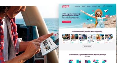
This renovation that YoMeAnimo undertakes goes beyond the aesthetic. The search for renewal and professionalization had the objective of being the expression of the evolution of this enterprise that became a company. To do this, we began to reimagine the brand experience in a "complete" way, encompassing its brand and digital identity, the tone of its communication, its graphic systems, as well as the interface and user experience of its website, which is the central element for the company's business.


Brand
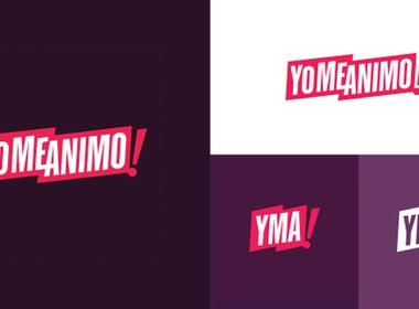
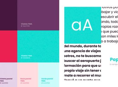
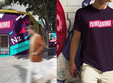
We created a brand that rescues the essence of its origins and gives it new life and strength so that the message is heard further away! Yomeanimo is a community-based brand, and the sense of belonging was an element, not only to maintain but to enhance.
Synthesis and iconicity, and the strong responsive nature of the brand identity are the strategic characteristics that Disruptive incorporates in this rebranding.
YoMeAnimo is a brand prepared for a digital environment, social networks, multi-device, and multi-platform, which must inform, motivate and generate trust.



Illustrations
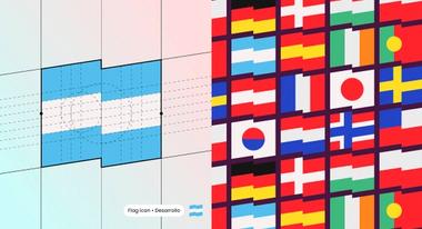
To accompany the high degree of humanization required on the website, we created a system of illustrations and identity iconography based on the graphic language of the brand to achieve a more immersive, effortless, and enjoyable user experience.


Digital product
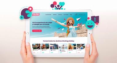
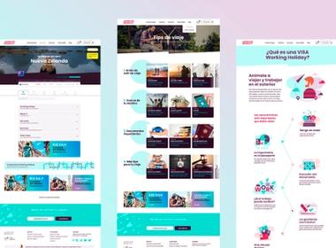
Reimagining the experience and user interface of this site had many obstacles that made it extremely complex. At the beginning, the amount of information and content needed to be ordered and prioritized, in turn, we worked with the client to rethink navigation and clarify the service offer.
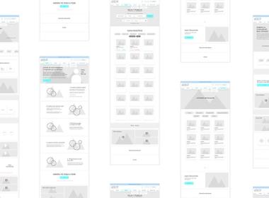
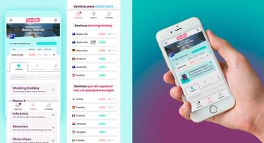
After surveying all the information architecture, an extensive wireframing stage was essential to determine the nature of the sections that the site needed. This led us to orient sections with an experience closer to an application, and a focus on the mobile version of the site, considering a user between 18 and 35 years old.
The result is a site of great vitality, clarity of communication, with a visual identity that does not lose coherence despite the wide variety of functional, informative, and commercial content with which it coexists. It's a website that at times functions as an app for consultation, and that is always presented as a pleasant and positive experience for the user.

Recognition & Press
Recognition & Press


